RIOT: Festival Case Study
A 10-week project focused on creating a visual system for a literary festival consisting of user personas, journey maps, typography, and more.
Role
UI/UX Designer
Industry
Entertainment
Duration
3 months

Project Overview
RIOT is a speculative banned books literary festival designed for the University of Washington campus. This ten-week project focuses on building a complete visual and experience system for a literary event that centers accessibility, low commitment, and political engagement. The festival is intended for people who are curious about books and ideas, but may not identify as part of traditional literary spaces.
RIOT reframes reading as a form of resistance. By celebrating banned books, the festival positions learning, discussion, and storytelling as tools for disrupting harmful laws and systems. The project spans research, branding, environmental graphics, wayfinding, user flow, and a fully prototyped mobile interface.
Core Value Proposition and Unique Selling Point
The core value proposition of RIOT is accessibility without dilution. Unlike many literary festivals that require high ticket prices, long durations, or insider knowledge, RIOT is designed to be approachable and flexible. Attendees can participate without a financial commitment, attend all events without scheduling conflicts, and engage at whatever depth feels comfortable.
The festival’s unique selling point is its focus on banned books combined with a low-pressure, all-access format. RIOT offers three days of programming that includes local authors, student showcases, book vendors, and interactive writing workshops, all designed to coexist rather than compete. This structure removes the fear of missing out and allows attendees to explore freely.


Initial Research
To ground the concept, I researched three established literary festivals with very different models and audiences. The Portland Book Festival is a one-day event located in southwest Portland. I chose to study it because of its emphasis on accessibility and low commitment, particularly for casual literary audiences and younger attendees. The LA Times Festival of Books is a large, two-day event that is completely free and attracts massive crowds. I examined this festival to understand how scale and free access shape audience behavior and expectations. The Hay Festival is a week-long international event that blends free and ticketed programming across multiple stages. I was particularly interested in its experimental offerings, such as themed days like Sports Day, which expand the definition of what a literary festival can be.
Across all three festivals, a common challenge emerged: too many events happening at the same time. Attendees are often forced to choose between sessions, leading to missed opportunities and fragmented experiences. Large scale also creates long lines, crowded spaces, and less intimate interactions.
Another key insight was audience targeting. The Portland Book Festival strongly caters to youth and students, while the LA Times and Hay Festivals skew toward adults without families due to their size, duration, and logistical demands. These patterns highlighted an opportunity to design a festival that bridges audiences instead of narrowing them.
Audience and Personas
Personas played a major role in shaping RIOT’s design decisions.
Ella represents a curious first-time attendee. She is creative, social, and interested in arts and crafts, but unsure whether a literary festival is “for her.” She prefers interactive experiences, low ticket prices, and events that feel social rather than academic. Her hesitation emphasizes the importance of low-cost entry and mixed-media programming.
Gwen represents an experienced literary participant. She is deeply involved in the literary scene, enjoys author readings, and is comfortable paying for tickets if the value is clear. She is drawn to recognizable authors, workshops, and opportunities to socialize with like-minded peers. Designing for Gwen ensures that RIOT still offers depth and credibility.
Jenna represents a visitor and general public audience. She enjoys writing casually but is unfamiliar with the UW campus and large festivals. She values clarity, easy navigation, and flexible scheduling. Jenna's needs directly informed signage, maps, and digital tools that reduce anxiety around wayfinding and planning.
Customer Journey
Gwen's journey illustrates RIOT’s intended experience. During the awareness stage, clear messaging around free access, programming variety, and scheduling flexibility is critical. In the consideration stage, social media and posters must communicate exactly what is happening, when, and where.
During purchase and delivery, the goal is to minimize friction. Registration should be fast, intuitive, and optional for many activities. During and after the festival, reminders, maps, and follow-up communication help attendees feel oriented, included, and encouraged to stay connected.
Wordmark and Visual Direction
The RIOT wordmark was designed to convey empowerment, rebellion, and disruption. I chose Trade Winds, a subversive script typeface with exaggerated descenders and irregular forms. The descenders on the “R” create a sense of unrest and individuality, visually pushing against convention.
Torn page edges reference books and printed text, while also evoking protest posters and damaged materials. This balance between literary tradition and disruption reinforces the festival’s core message: questioning what knowledge is allowed and who gets access to it.
The mood board draws heavily from protest imagery, rebellion, and education as resistance. Many of the references echo historical and contemporary protest posters, reinforcing the idea that banned books are part of a larger struggle for expression and freedom.
Red serves as a dominant color throughout the system. It is bold, confrontational, and emotionally charged, mirroring the urgency of censorship debates. The imagery is meant to rally people in the same way protest graphics rally movements.


Color and Typography System
RIOT uses a triadic color palette built around red, yellow, and blue. Red represents fight, urgency, and empowerment. Blue and green bring in resilience and growth, grounding the system so it does not feel chaotic. Yellow adds brightness and visibility, signaling refusal to blend in or remain quiet.
Together, the palette communicates boldness and endurance while remaining flexible enough for large-scale application across print, digital, and environmental graphics.
Trade Winds is used primarily for the wordmark and high-impact text, such as stage names and key dates. Its brush-like terminals give it a hand-painted, protest-sign quality. Inter is used as the secondary typeface for body copy and supporting information, ensuring readability and accessibility. Hierarchy is created through weight, size, and spacing rather than excessive decoration, allowing the visuals to remain expressive without sacrificing clarity.
Poster Design
The festival poster prioritizes a clear visual hierarchy. Trade Winds is used for the wordmark, main-stage speakers, and dates to establish identity and emphasis. Inter is used for supporting information, with bold weights highlighting key details.
Size and placement guide the viewer from the most important information down to secondary details, making the poster legible at a glance while still rewarding closer inspection.
Signage and Wayfinding
Festival signage was designed to communicate both current location and the relative positions of other stages. Initial signage concepts were refined after critique to increase clarity and cohesion. Torn edges were removed from signage to maintain professionalism and better align with the map system.
Color matching and font consistency ensure that signage, maps, and posters feel like parts of the same system rather than isolated artifacts.
The festival map shows the locations of three main stages, parking, information booths, and food stalls. It uses the same color palette and typography as the rest of the system to maintain visual continuity.
After critique, outgoing street lines and clearer labels were added to improve orientation. A short blurb and logo reinforce the festival’s mission without overwhelming the map with text.
Mobile Interface
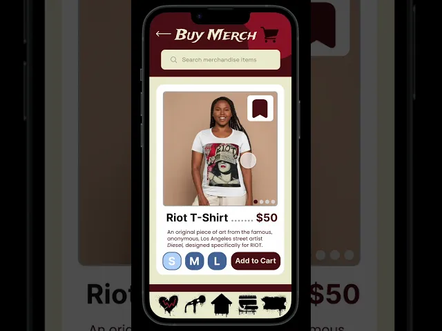
The mobile interface supports festival navigation and merchandise purchasing. The primary user flow follows Prisha as she browses merchandise, selects an item, and completes checkout.
User testing revealed friction points, including the need for an intermediary product detail screen and clearer navigation cues. Iterations focused on reducing cognitive load, minimizing required actions, and ensuring users could easily move backward if they changed their minds.
Outcome
RIOT became an exploration of how design can support messaging without alienating users. By prioritizing clarity and flexibility, the festival balances rebellion with usability.
The project demonstrates my ability to move from research to strategy to execution across branding, environmental design, and digital interfaces, while maintaining a cohesive narrative and visual system.