
Redesigning the Backyard Fun Finder for King County Parks
A UX research and redesign initiative improving the digital park-planning experience for visitors with accessibility needs.
Role
UI/UX Researcher
Industry
Community
Duration
6 months
Problem Statement
How might we improve the existing digital planning process of going to a King County park for people with accessibility needs?
The existing King County Parks Backyard FunFinder tool suffers from heavy information overload, low visual contrast, and a lack of key accessibility details (such as path slope, elevation, surface material, and ADA ramp locations), making park discovery frustrating for users with access needs.
Stage 1: Research & Discovery
To understand the core obstacles park visitors face, we conducted user interviews, surveys, and a preliminary usability test on the live FunFinder site.
Competitive & Domain Context
Existing Backyard FunFinder Tool: Relies on dense ArcGIS maps, overlaid symbols, and complex filter menus that overwhelm users upon landing.
Accessibility Needs Gaps: Standard mapping tools rarely detail micro-accessibility factors like trail width, slope grade, surface pavement ratios, or real-time barrier/closure alerts.
User Quotes from Preliminary Interviews
"Information overload is the biggest issue—there's so much on the screen at once that I don't even know where to start looking for trail details."
— Usability Test Participant
"When planning a trip, I need to know the exact parking layout and whether paths are actually paved before I commit to traveling there."
— Interviewee with Physical Access Needs
Key Survey Data & Usability Testing Insights
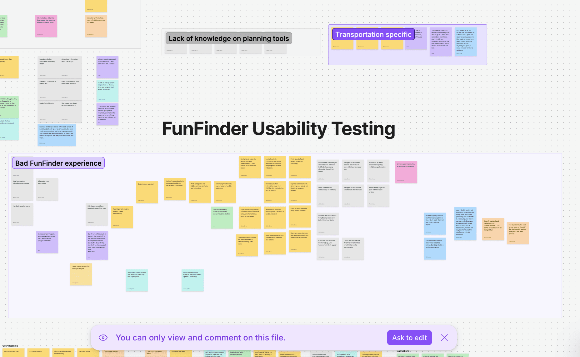
Through affinity mapping across our initial test rounds, five primary themes emerged:
Dense initial views (open lists, visible legends) caused immediate cognitive fatigue.
Low contrast on park map pins and confusing legend icons made spatial navigation difficult.
Users explicitly sought data on ADA ramp locations, paved path counts, path width/elevation, and parking costs.
Abstract metrics like "Walkability Score" caused confusion without defined contextual guidelines.

Stage 2: Personas & Journey Mapping
We created two primary user personas—Alison (an athlete evaluating terrain) and Mike (a parent navigating family accessibility needs)—to keep our synthesis grounded in realistic user goals.
User Journey Map
We mapped Mike’s end-to-end journey from initial park discovery to arrival, pinpointing high-friction touchpoints on the original tool.
Stage 3: Key Research-Driven Iterations
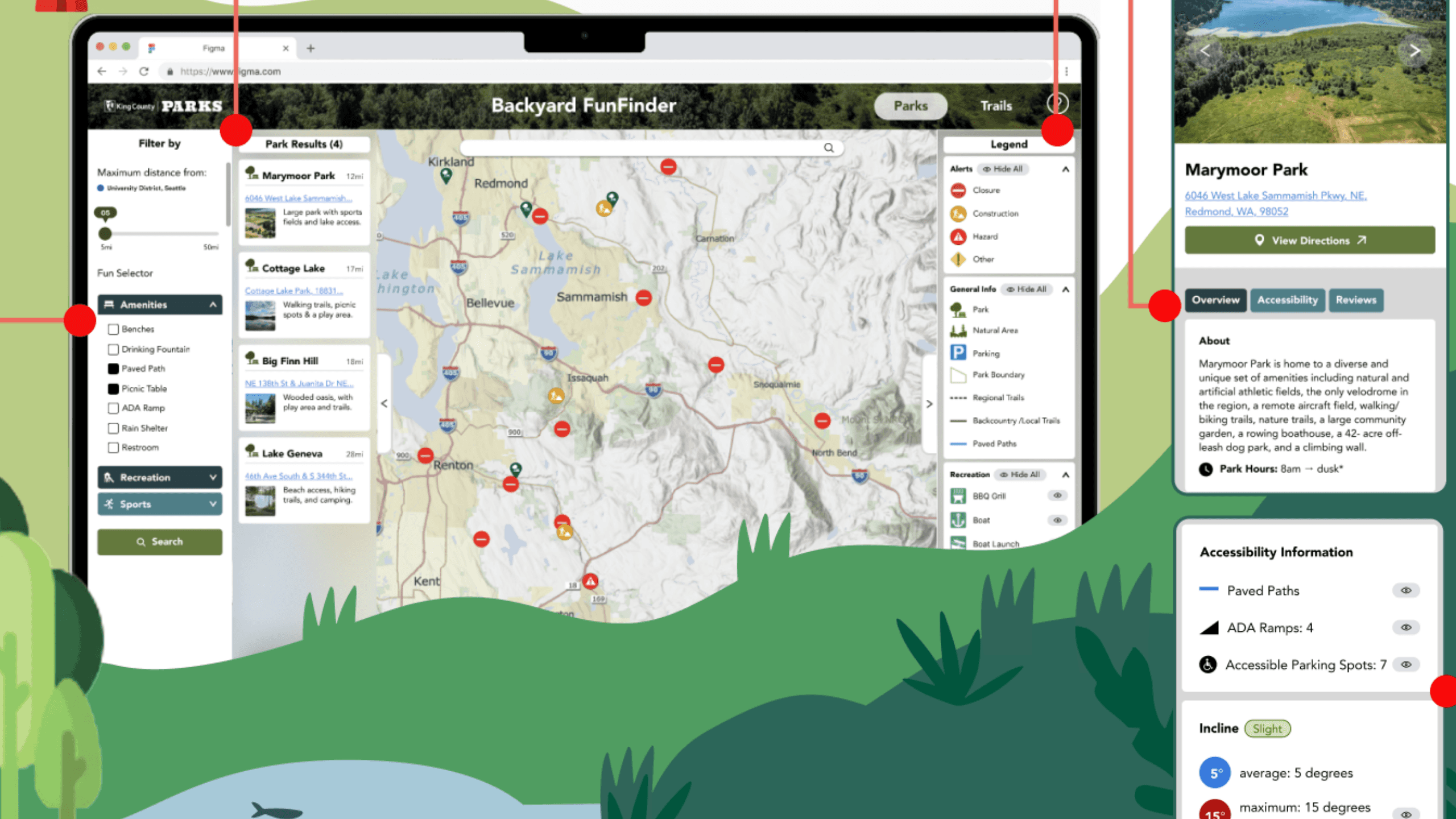
We translated research findings into clear design decisions across five main interface areas:
Fun Selector (Filtering):
Decision: Reorganized filters into collapsible categories to eliminate initial visual noise.
Decision: Added explicit accessibility filters (e.g., ADA ramps).
Park List:
Decision: Kept the list collapsed by default; loaded results only after filtering.
Decision: Upgraded park cards to include thumbnail photos, short summaries, distance indicators, and full addresses.
Map Legend & Controls:
Decision: Formatted legend into a single-column layout with clear category accordions.
Decision: Replaced subtle icon toggles with visible, explicit "Show/Hide" alert buttons.
Park Preview Card:
Decision: Added photo carousels, parking fee details, operating hours, and direct links to official park updates.
Map Interface:
Decision: Increased icon color contrast and added map zoom controls to improve spatial navigation.


Final Prototype & Concept Testing
Our mid-to-high fidelity prototype was evaluated through a final round of task-based usability testing ($30 compensation, target access-needs cohort). Testing measured task success around identifying ADA ramps, evaluating terrain basemaps, and reading hazard closures.
Key Outcomes & Success Metrics
Reduced Cognitive Load: Collapsible sidebars and state-based list loading significantly decreased user-reported overwhelm scores.
Improved Task Speed: Standardized park cards enabled participants to find parking fees and transit routes in under half the time of the original tool.
Clearer Accessibility Guidance: The inclusion of slope overlays and ramp identifiers directly addressed the top pre-trip planning barriers.
Conclusion
Our research-led redesign successfully bridged the gap between complex GIS park data and actionable, accessible planning for King County visitors. By prioritizing progressive disclosure, higher visual contrast, and micro-accessibility metrics, the new FunFinder framework empowers users of all physical abilities to plan trips with confidence.
Take a look at our final poster and our demo video below, or here.